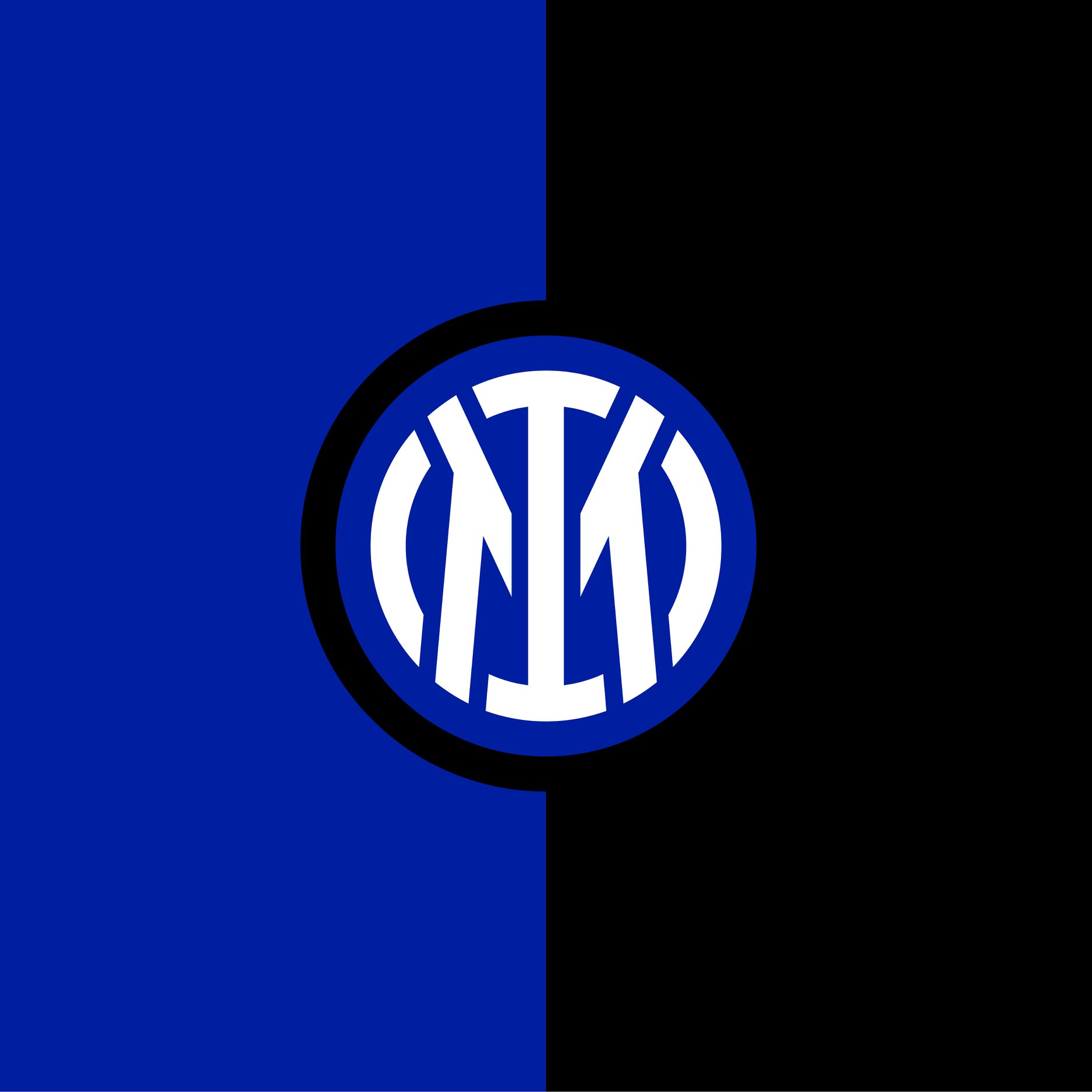
Italian Serie A title favorites Inter Milan have unveiled their new look logo. It will be used as the club’s kit crest starting with its 2021/22 match range.
According to Inter Milan:
Innovative, minimalist, elegant and oriented towards new generations. The new crest synthesises the values of Inter, focusing only on two elements in the process: the I of Internazionale and the M of Milano.
The task of designing the new logo was entrusted to the Bureau Borsche team, a leading graphic design studio of international standing.
From the four intertwined letters originally created by Muggiani to just I and M. However, the new design has a 90% similarity to the Club’s very first crest. The latest one is particularly suited to digital devices and can be clearly seen.
Such visibility on mobile devices and increasingly smaller screens is critically important nowadays when looking to achieve the right exposure.
Graphically speaking, the shape of the I reminds us of the F that is no longer present in the new crest. The design of the M remains very recognisable and similar to the one that appeared on the original logo. As per Nerazzurri tradition, the letters are framed by the classic concentric circles.
Furhtermore, the choice of colours, particularly the new blue, which is more intense and vibrant, makes the new crest more noticeable and recognisable. Our colours remain those from the night of 9 March 1908, at the Orologio restaurant: those of the sky and the night. They are simply brighter.
Moreover, the Nerazzurri badge will be a lot more visible on computers and digital media. Yellow will be back in, also with a brighter, more modern shine to it. The gold hasn’t gone, with it expected to be used mainly on the most iconic physical pieces in order to not impair visibility in digital environments.
Two fonts form the typography basis: GIORGIO BOLD is the primary font and used in the logo. The secondary font is UNIVERS ROMAN 55, which is used for texts.
