


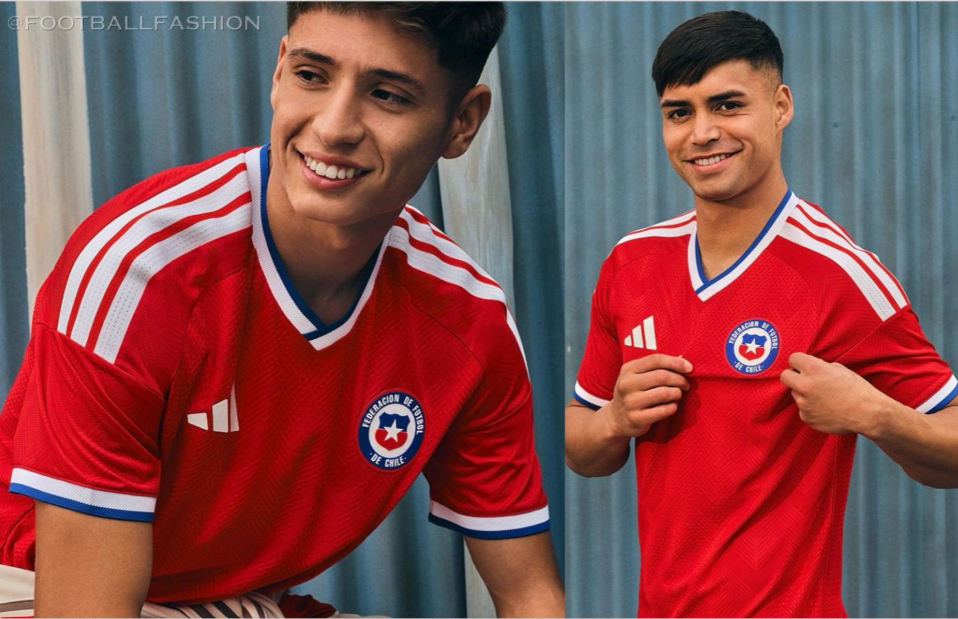
Can you judge a team by its kit? Perhaps. Certainly a lot of people would like to. But if you look at the number of changes that Manchester city has undergone over the years, formulating one theory becomes a fair challenge. Nonetheless, it is interesting to take a look back and assess just how many changes the team has undergone. Indeed, the alterations have been many and varied, and it is easy for devoted fans to identify a time period by a look at past kits.

This is just one of many things that devoted fans take the time to notice. Indeed, true devotees are basically pro statisticians for their team. And many of them use this to their advantage by taking the time to get on their team’s chances. And betting on the Premier League in particular has been creating huge opportunities for savvy bettors.
A historical evolution
That said, let’s go all the way back to the ‘60s and take a chronological look at all the changes this team has undergone in the last 80+ years.
The ‘60s
The early years of City’s kit saw not only varied home and away looks, but a different badge, as well. Their home kit resembled the sky they played under, with a familiar light blue and white theme. City’s away kit was different: It started off the decade with maroon, and later moved into red and black, having been inspired by AC Milan.
At that time, the team had a circular badge that later started being used not only for official team documents, but also later on players’ shirts.
‘70s to ‘90s
The next three decades saw something of a continuation for the team kit, with a few minor alterations. The blue and white theme of the home kit remained, although hard core fans will remember that there were some variations along the way.
- Towards the beginning of the ‘70s, kits had a very minimalist look to them. The body of the shirts was a solid light blue, and there was white trim on the collar and sleeves. What branding the kits had was subtle, and for the most part only the club badge was visible. The badge itself started changing during this period, though, first incorporating the city’s coat of arms and after several years switching to the red rose of Lancashire.
- By the ‘80s and ‘90s, kits started to exhibit more variety in both color and design. Collars took on different forms, and sleeves started varying in their designs, as well. The patterns used on the kits took several different forms throughout this period, and even the materials used started to vary. Rather than simply sticking to the same cotton fabric that the kits had used in the ‘60s, later decades saw more of a move towards synthetic material. This was thought to enhance player performance, as well.
- Another major feature of the ‘90s in particular was that sponsors started being incorporated into City’s kits. Some logos, such as the “Brother” branding, became quite prominent on team shirts.
- Also shifting during this period was the brand used in the kits. By the ‘90s, Umbro and Kappa had become the main manufacturers, which was largely the reason for the change in styles.

‘90s and 2000s
The next two decades saw even more experimentation among home kits in particular, including variations on the shade of blue used. In addition, new sponsors came along, including Le Coq Sportif and Reebok. And perhaps the most notable change during this period was the change in City’s badge.
There were a variety of reasons for the change: the club faced both trademark issues and criticisms from fans. They decided to let go of the circular badge and its design, and switch to a shield bearing a golden eagle, stars, and a new motto (“Superbia in Proelio”).
2000s to today
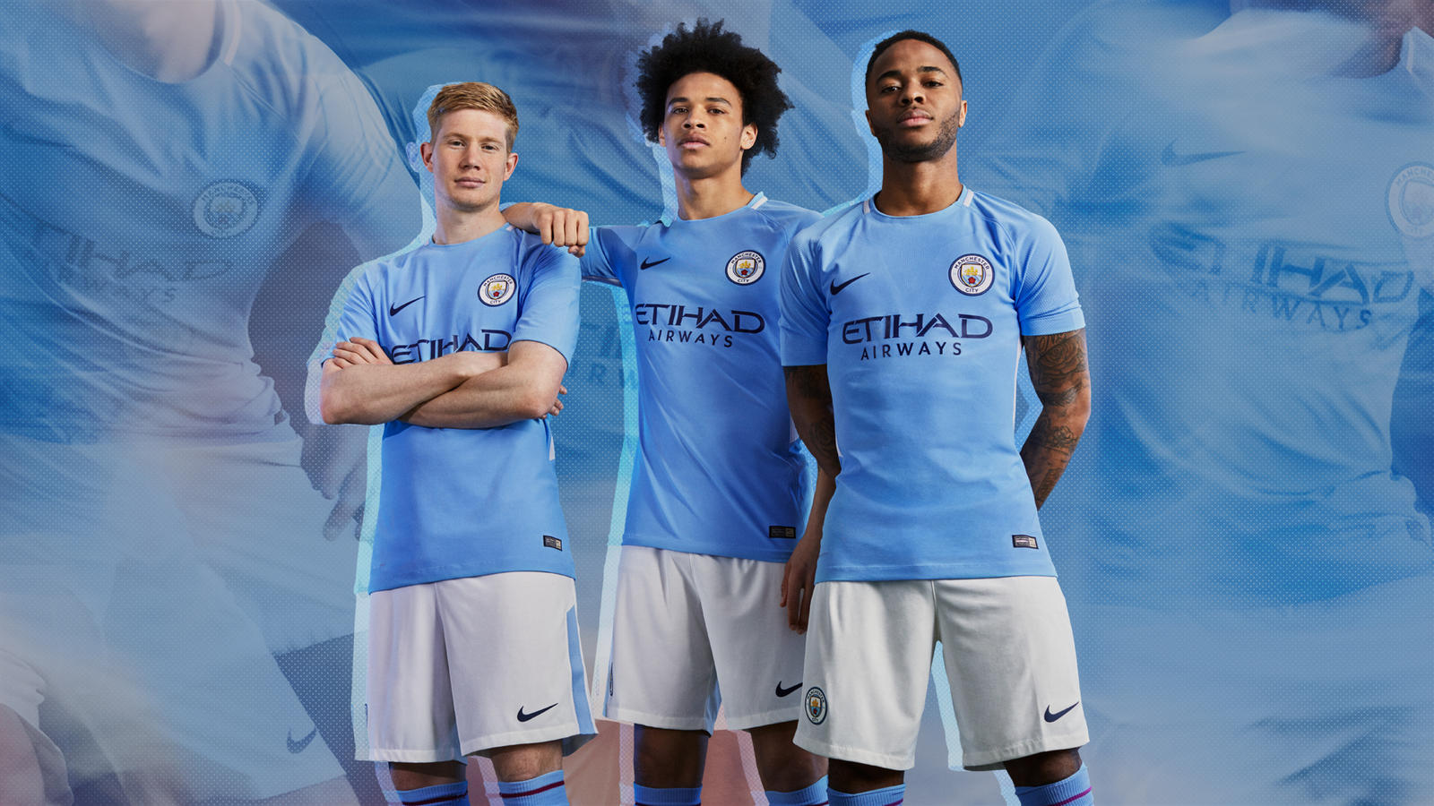
Recent decades have seen even more small adjustments in city’s kits, including slight changes in shades and design. Among other things, a sash and other graphic elements have been included. Sponsors now include Puma, Nike, and Umbro.
And designs will surely evolve further still. While we can all harken back fondly to the days of yore, evolution is inevitable. And this applies just as much to the world of sports as anything else. So we shall see what the future has in store for this great club!
